09
Noetica Healing
2026

Bondi, please.
NOETICA began with a rejection of what wellness has started to look and sound like. The immaculate morning routine. The green juice. The matching Pilates set. The idea that if we optimise ourselves enough, eventually we’ll arrive at some perfect version of who we’re supposed to be.
That isn’t NOETICA.
We imagined the woman behind the brand instead. She’ll go to yoga and have a wine afterwards. She cares about what she puts into her body, but might still smoke a cigarette over a long conversation. She’ll spend $600 on the jacket of thy dreams and maybe drive a shitty car. She reads, travels, questions things, follows politics, loves art and understands that being conscious doesn’t mean being perfect.
There was something distinctly Bondi about that tension. A place where early-morning ocean swims, coffee, designer boutiques and sunset drinks exist within the same rhythm of life. Noetica's office is located in Bondi needed to inhabit that same space: wellness without purity, spirituality without performance, femininity without cliché.
From there, I developed a strategy around frequency, presence and trust. NOETICA doesn't tell people who they should become. It gives them space to hear themselves more clearly.
How do you create a spiritual brand that doesn't immediately look like a spiritual brand?
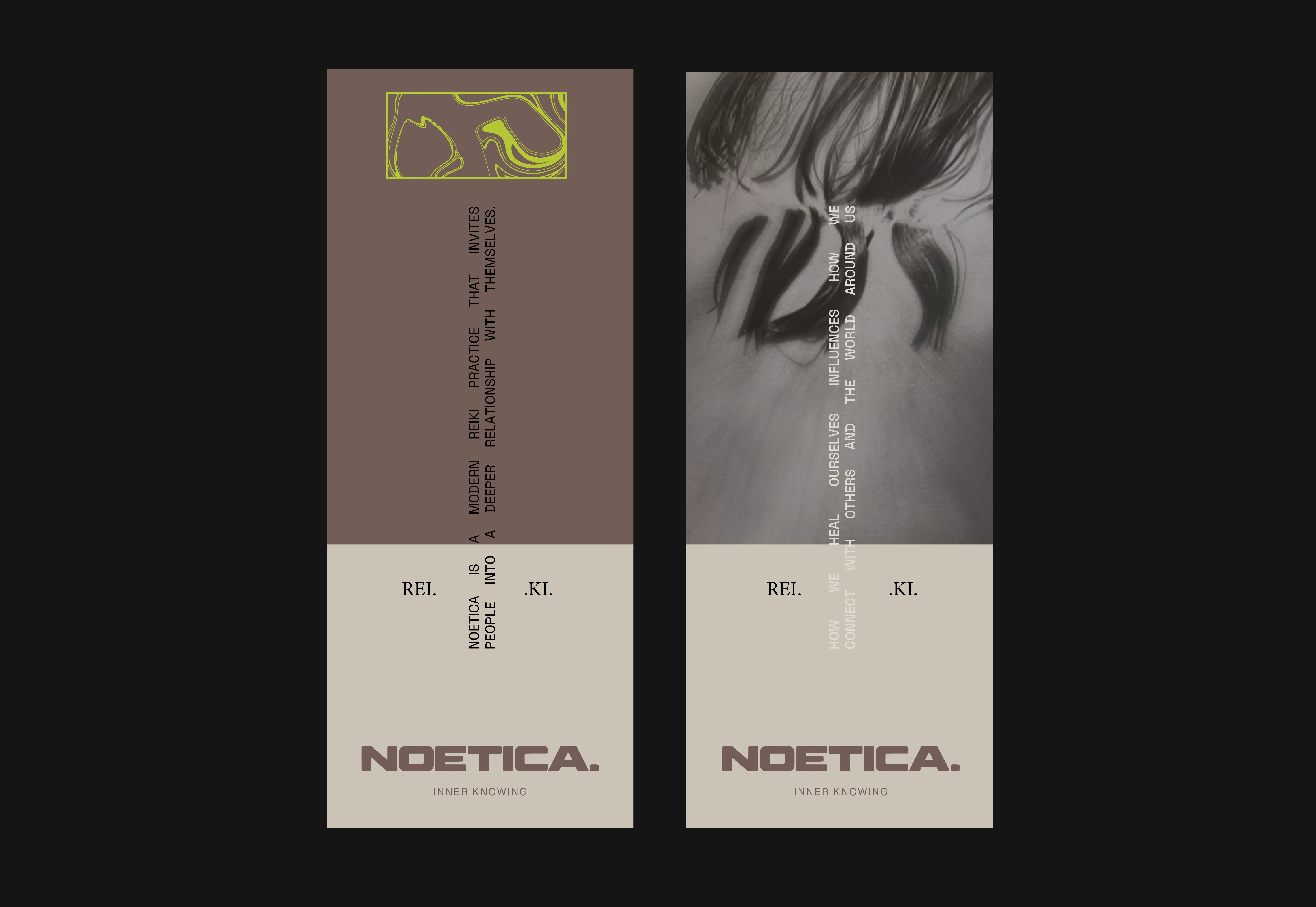
I deliberately moved away from the visual codes we expect from wellness: predictable sacred symbols, overly earthy palettes, celestial motifs and an aesthetic that feels too polished, pure or precious.
Instead, I looked towards editorial fashion, documentary photography, contemporary film, political movements, writing and art. The world needed to feel culturally aware and feminine, with enough imperfection to feel alive.
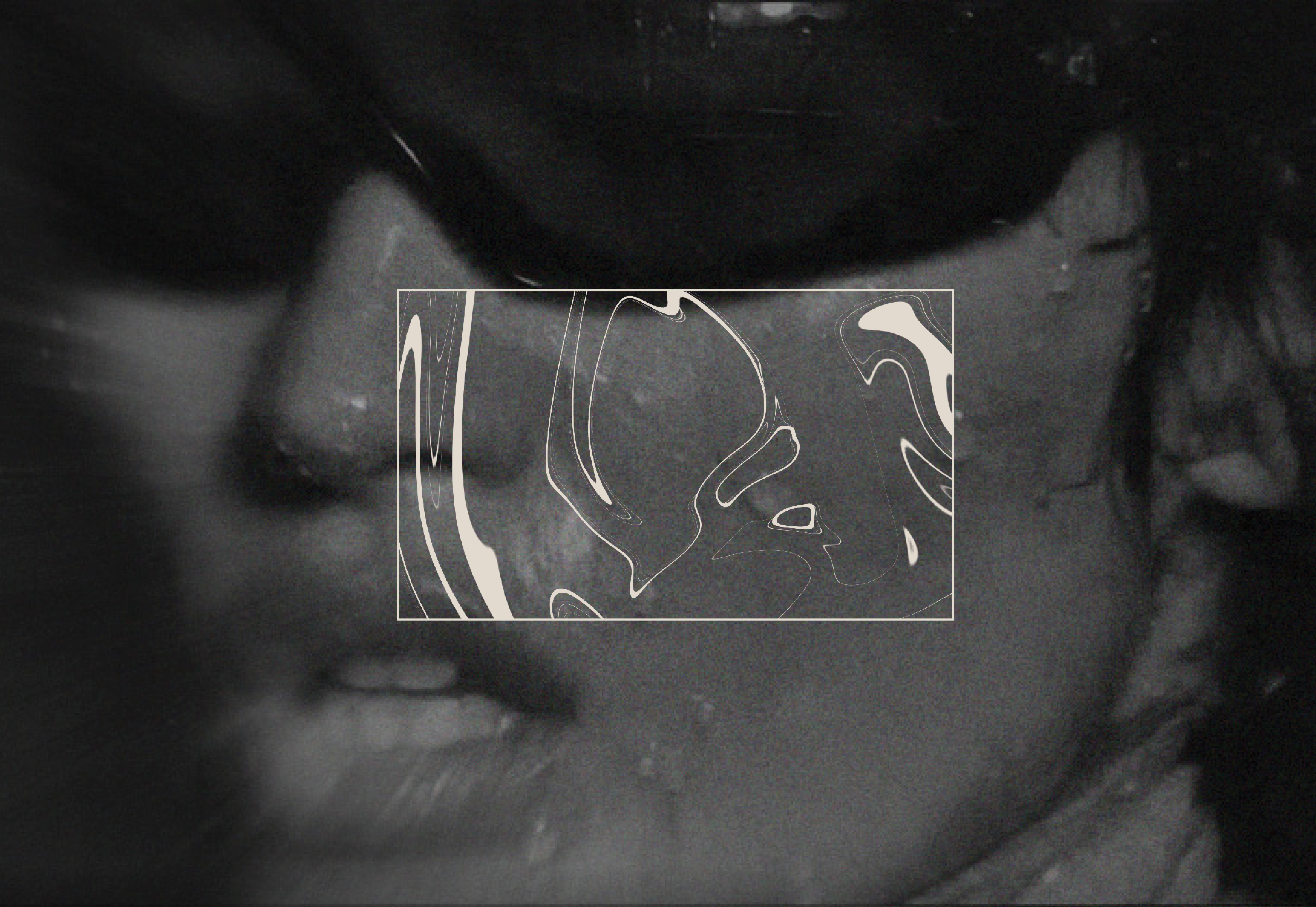
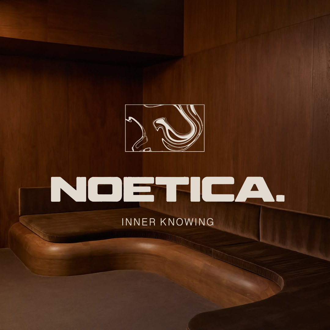
The same thinking shaped the logo. Reiki is an energetic system, so I wanted to find a way of making something invisible feel visible. The logo is built around movement, frequency and air. Its lines sweep, shift and almost dissolve into one another, as though the mark has been caught in a current.
It isn't a literal representation of Reiki, and that was important. You don't necessarily need to understand it. You need to feel it.
There is tension between structure and freedom throughout the identity: bold forms meet delicate lines; femininity meets strength; stillness meets movement. It mirrors the contradictions we defined in the strategy: Earthy, without the “woo" and authentic, not perfect.
Nothing is overly resolved. Nothing is trying too hard to prove that it is spiritual. Like NOETICA herself, the identity holds its own energy.
The final brand positions NOETICA not as somewhere you go to fix yourself, but somewhere you can return to yourself.
NOETICA doesn't promise transformation through perfection. It makes room for contradiction. You can be spiritual and sceptical. You can meditate and drink wine. You can care deeply about your nervous system and still make choices simply because they feel good.
The voice follows the same philosophy. It doesn't preach, persuade or hide behind inaccessible spiritual language. It asks questions. It starts conversations. It invites.
The result is a Reiki brand that feels less like entering the wellness industry and more like entering someone's world. A world of art, culture, politics, femininity, curiosity, long conversations, nature, sensuality and independent thought.
Maybe the point isn't becoming someone else at all. Maybe it's feeling safe enough to be more of yourself.